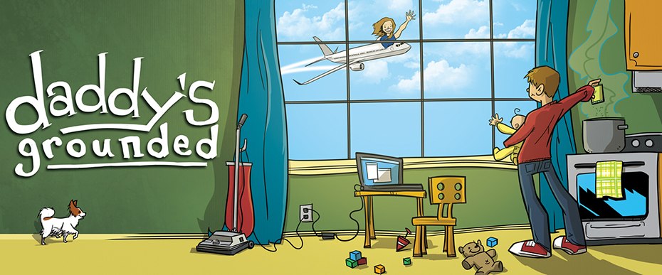
The Logo and How It Was Created
I am not an illustrator by any stretch of the imagination. The first version of the Daddy’s Grounded logo proves this. Stick figures are also not my expertise but that is beside the point. Five Iron Frenzy, a ska band that returned to the music scene last year, had some really great graphics designed for their come back. The artist, Chris Fason, took my stick figure idea and turned it into a masterpiece. Here is a glimpse into the journey of the Daddy’s Grounded logo creation.
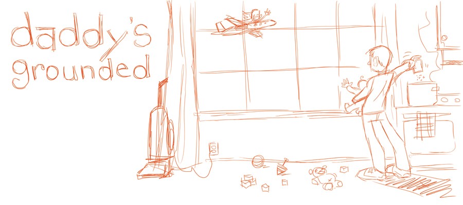
1.) The Initial Idea:
This first “sketch” was meant to be low quality. This stick figure representation was meant for placement of how I pictured things being. Chris and I talked a little about meanings of items and placement. He totally got the idea and ran with it.
2.) First Sketch From Chris:
The first thing I though of when I saw this? “This guy is a genius.” I loved the initial look and only suggested that a laptop computer be added, because I am always using a computer for something; work, school, freelancing, communicating with friend & family, etc.
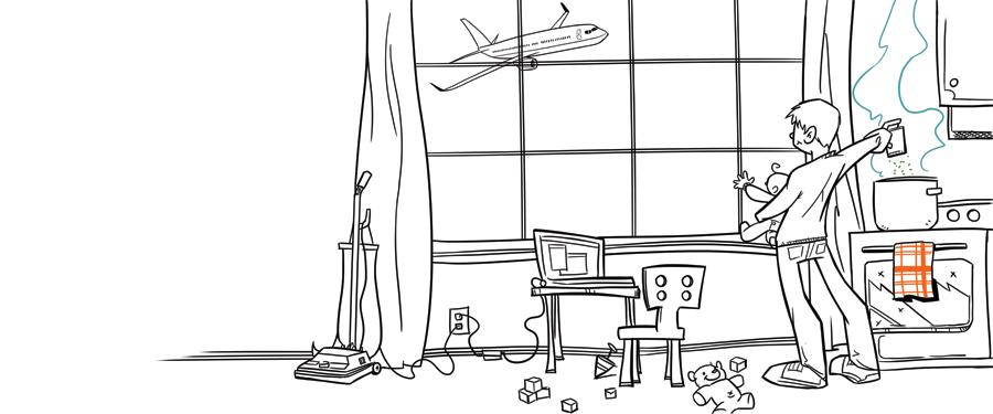
3.) Ink Drawing:
The initial sketch turned into a more detailed illustration with laptop and chair added. Chris asked for a photo of Abigail for a sketch and color preferences.
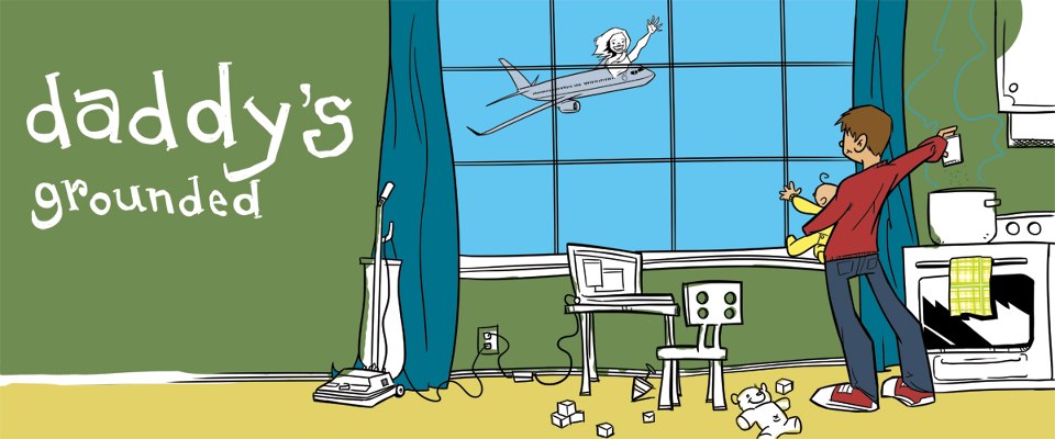
4.) Coloring Draft:
Abigail suggested green/blue/yellow and I agreed. A photo of Abigail was given for a cartoon of her to be used waving from the plane. From here is was all about the details: shading/layering/coloring, etc.
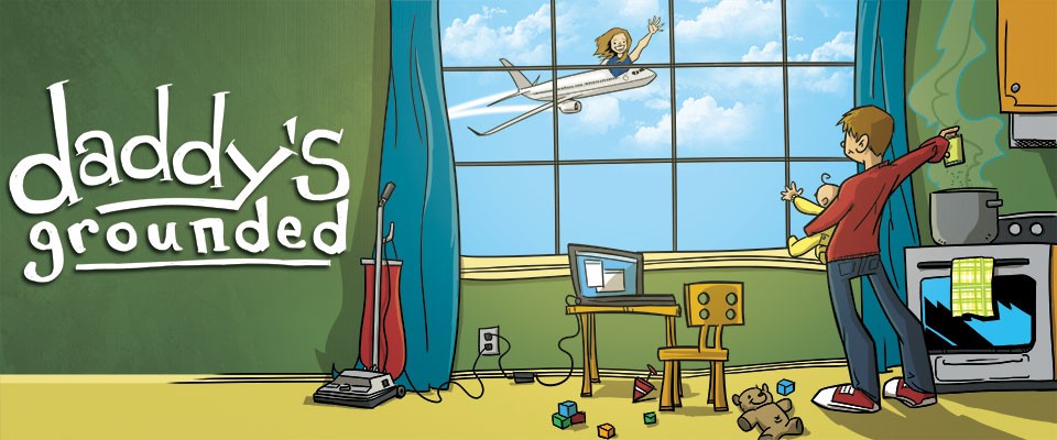
I think the final product is just perfect. If you do too drop Chris Fason a line and give him a little extra freelance work.
The first version of the logo forgot to include Phoebe! This has now been resolved.
Update: February 2019
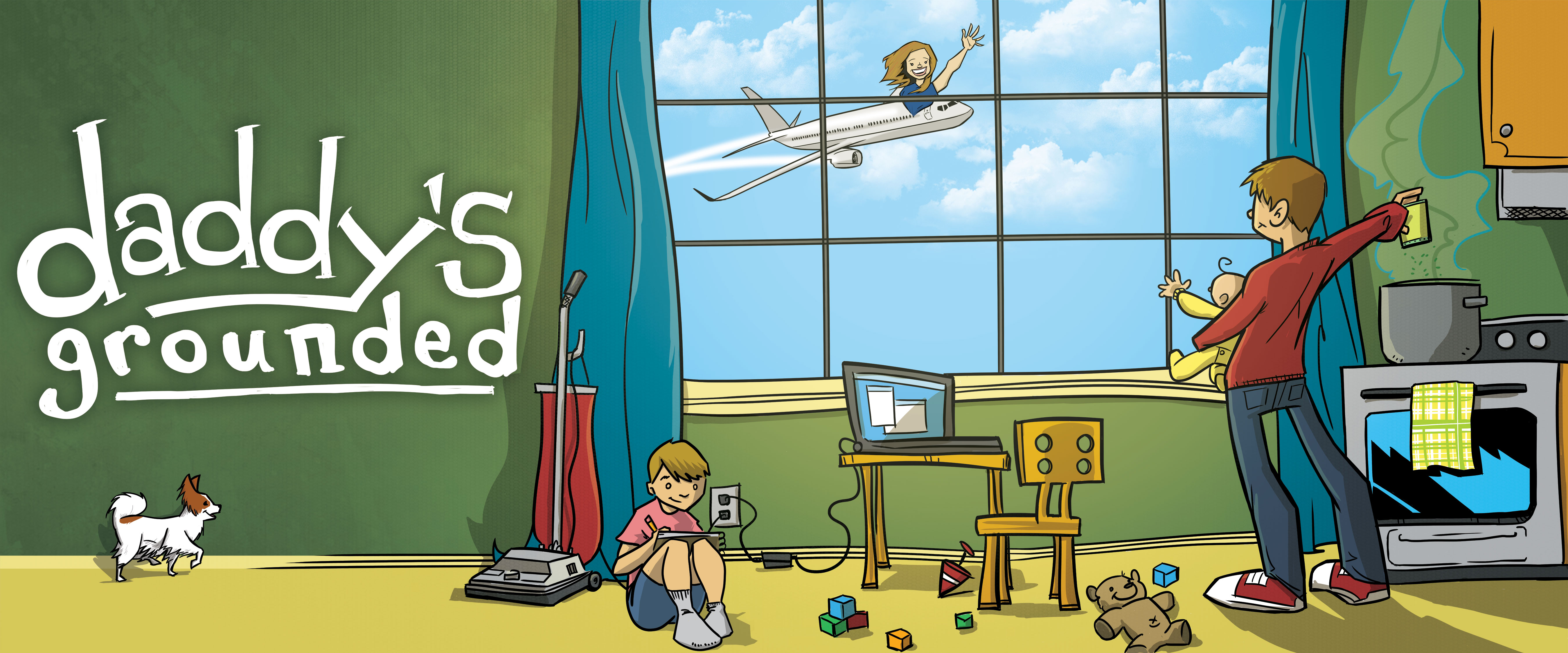
After nearly two years of having two kids and well beyond Wesley being small enough to carry in one arm I had Chris update the logo again. This time we added an order version of Wes and kept the smaller kiddo as a representation of Theodore.


